Uncovering a brand’s unlimited potential on a limited budget.
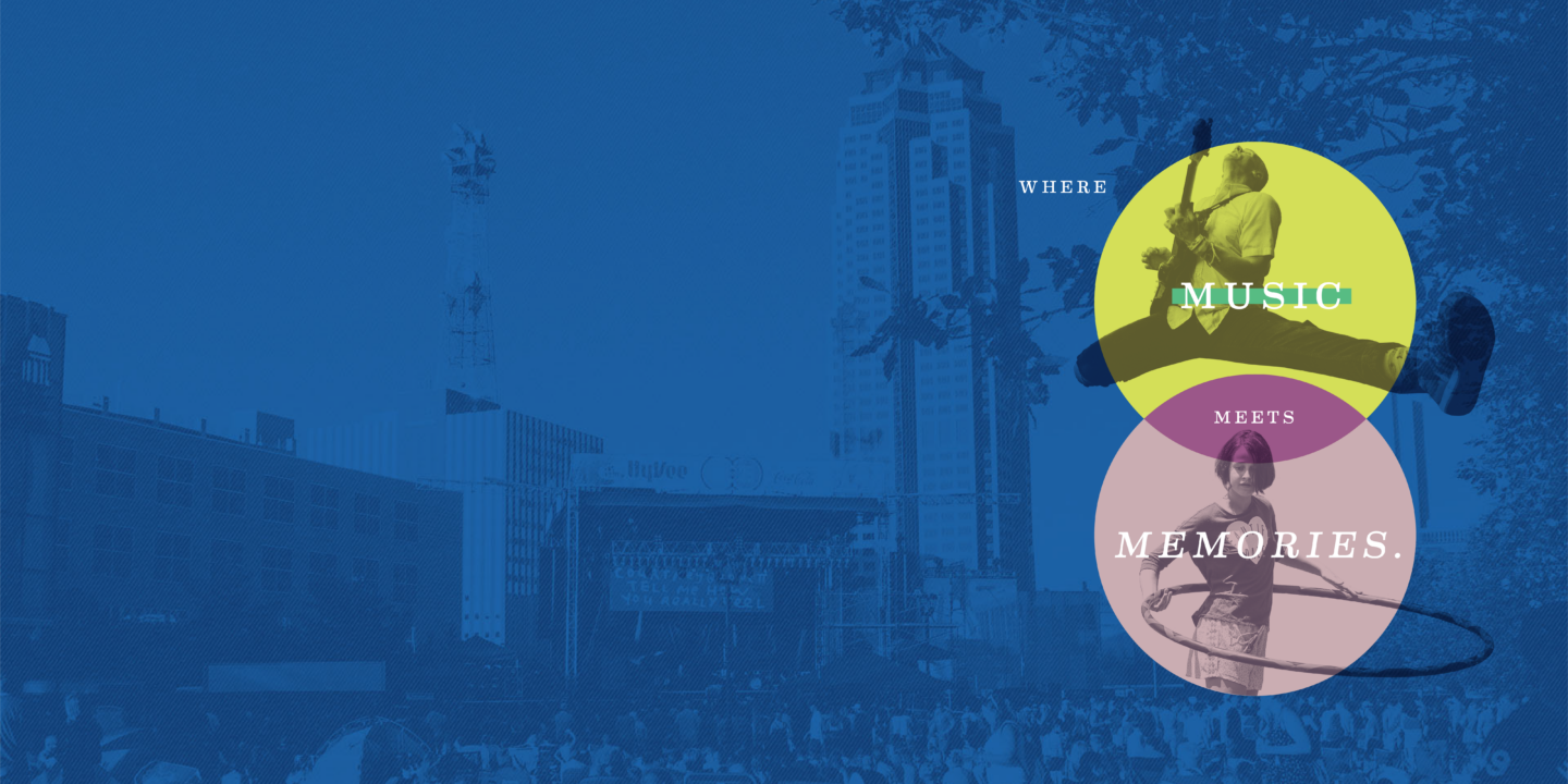
A brand for all bands.
Our Challenge
Elevating the event.
After ten years of solid growth, 80/35 was ready to elevate its brand by updating the look and feel to compete with national fests. Keep in mind, however, that we needed to ensure that we were responsible with the budget—it is a non-profit, after all, with several audiences to reach and missions to fulfill.
Our Solution
All the right notes.
We went back to the festival’s roots and mission and brought to the forefront the magic that happens at the intersection of 80/35, where food meets fun and harmonies meet happiness. 80/35 is truly “at the intersection of music and everything.” Then, we fine-tuned the creative and turned it up to 11 by developing an iconic brand look, poster designs, website, and more.
Brand elements
Just riffing.
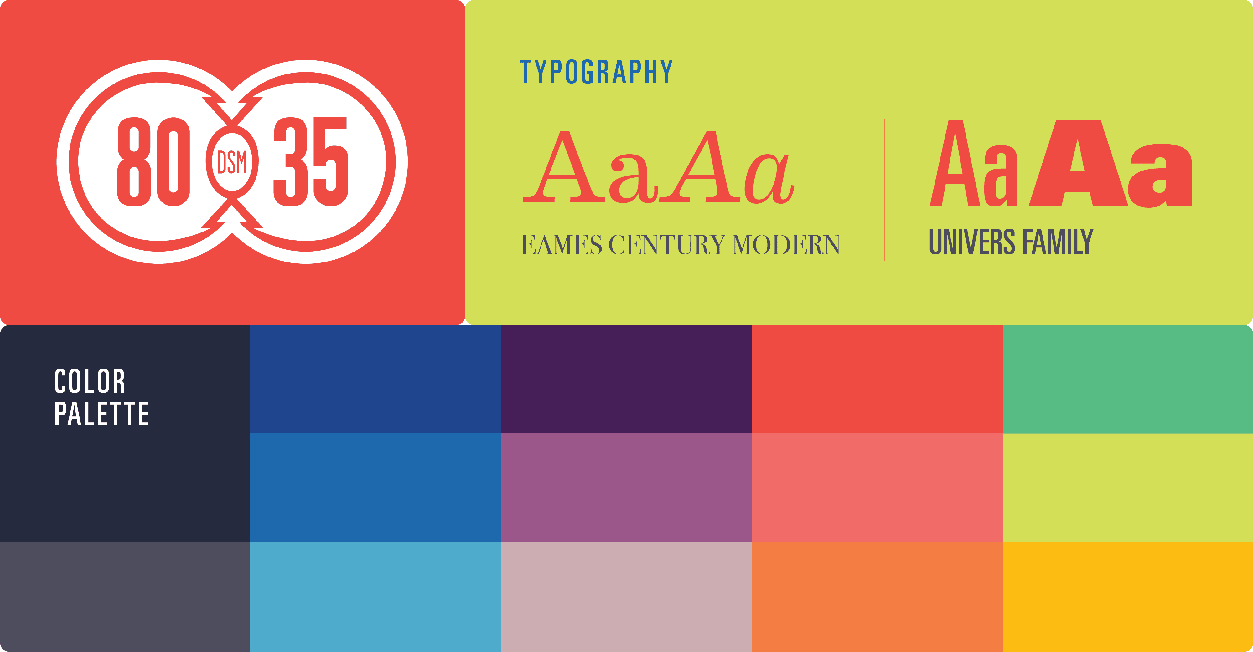
The new brand came to life with an updated color palette featuring bright, bold colors and simple typography to ensure the 50+ lineup was clean and easy to read. We also simplified the logo and used it in a whole new way on posters, digital assets, the website, and more. So very rock n’ roll.
Posters
Ready to rock.
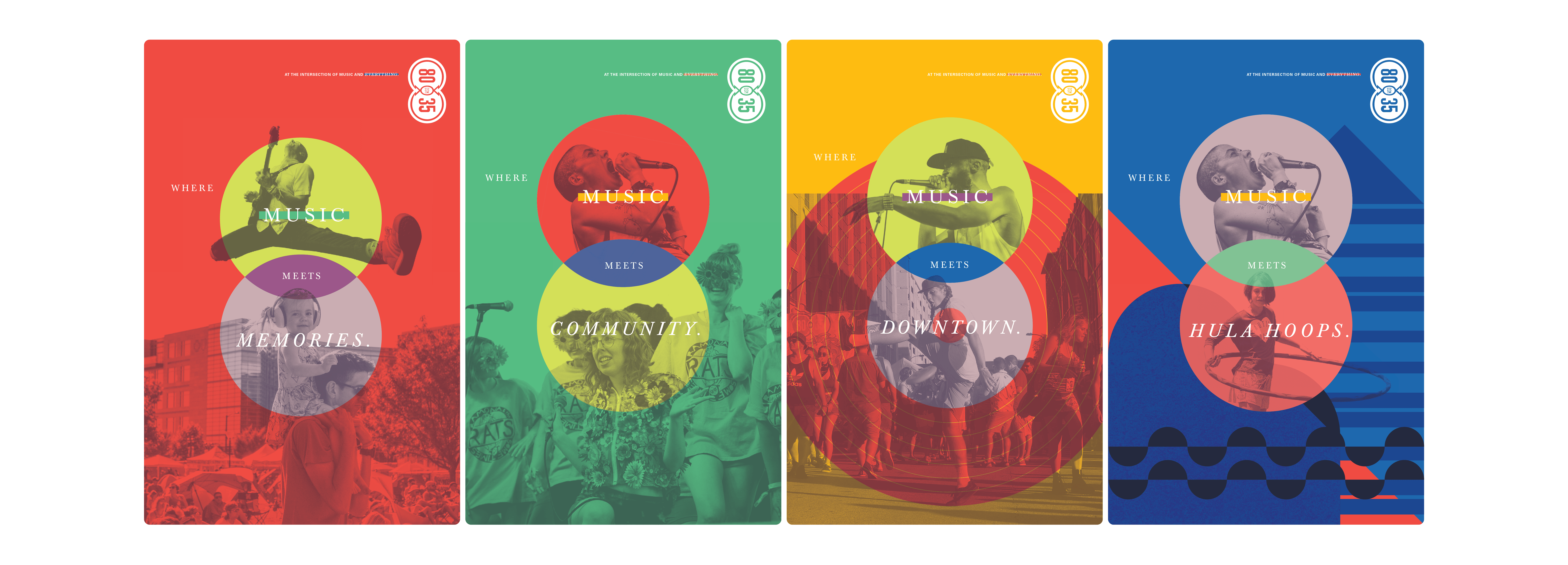
80/35 posters lined the windows of venues and coffee shops throughout the city. Featuring a mixture of illustration, graphics, and photography, the design conveyed chaotic fun while each layer revealed meaning beyond music, including food, sculpture art, and famous Des Moines landmarks.
Web
Click, click, buy.
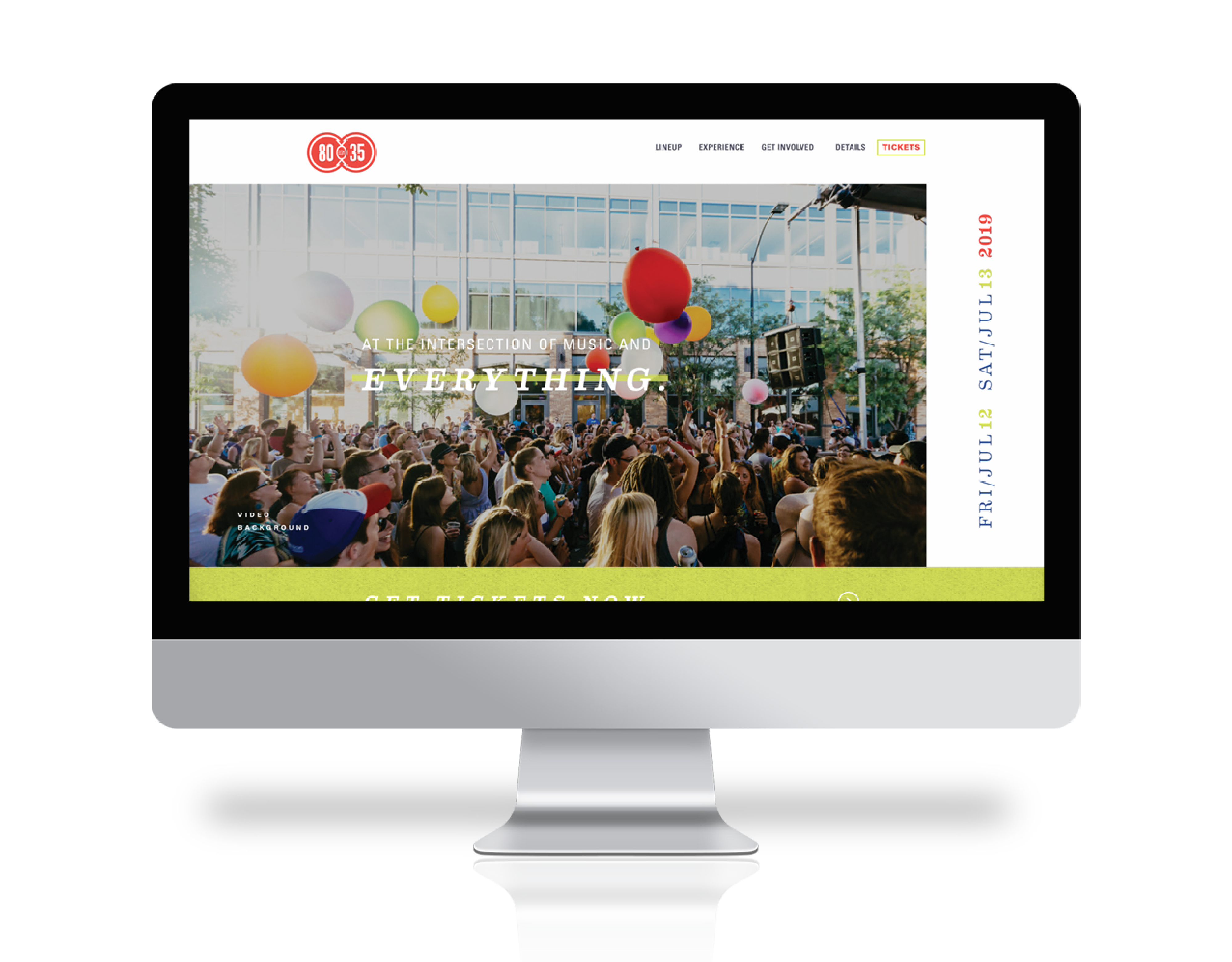
The website for the music festival not only featured the 50+ band lineup and links to build playlists, but it also needed to educate about the non-profit organization, enlist volunteers and—of course—sell tickets. We designed, wrote, and developed the site to accomplish all those goals and build hype for the one-of-a-kind event.
Video
Music in motion.
To be mindful of the budget, the Red Dot motion team created captivating videos using existing footage. Seamlessly incorporating the new brand design, the videos encouraged ticket sales and were a hit on social and digital platforms. That’s music to our ears.
Digital
Building digital buzz.
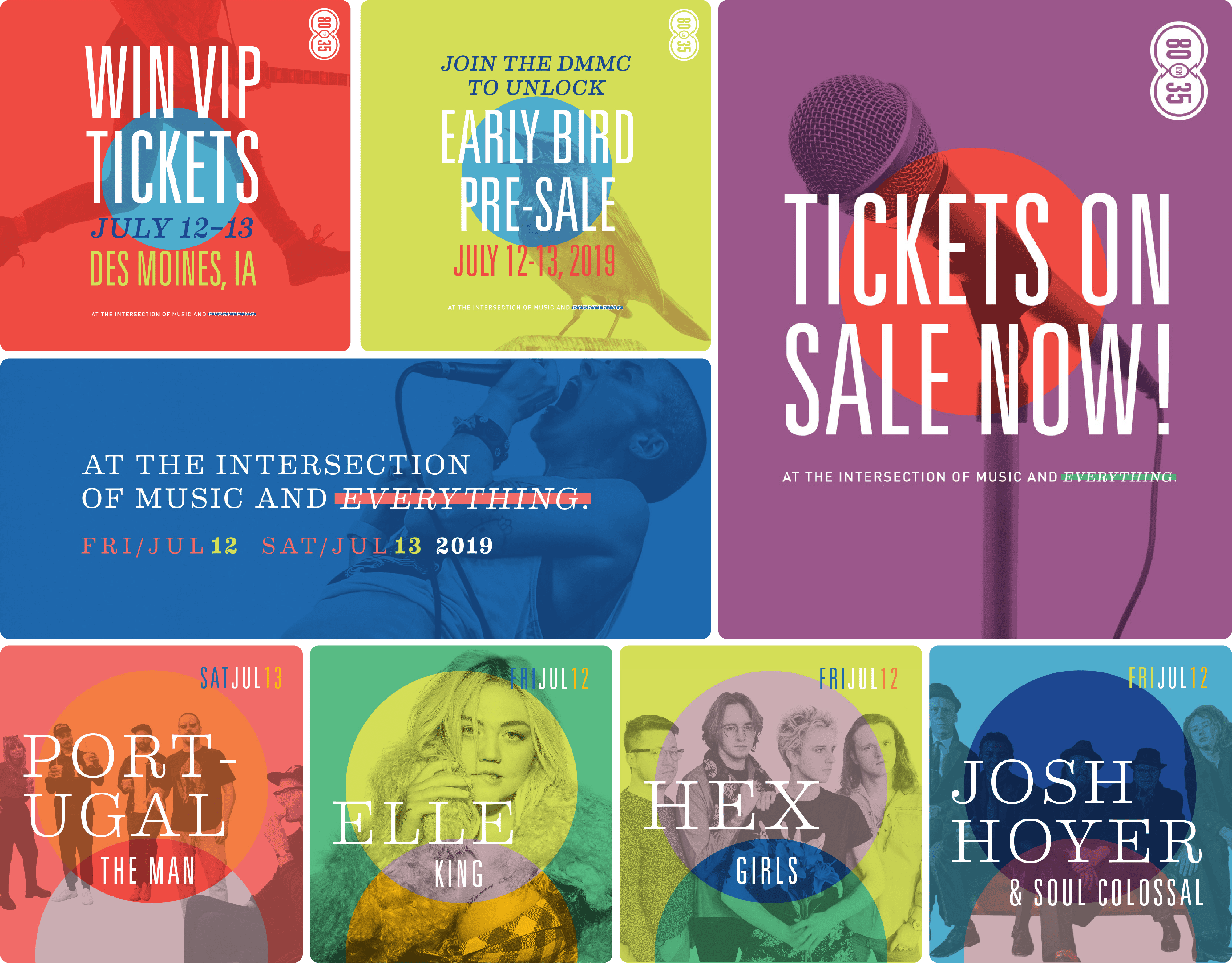
Building a branded and flexible digital library of graphics is an important part of event promotion. We created static and animated graphics in varying sizes for use on Facebook, Insta, and more. Graphics featured ticket pricing and deadlines, headliners, and promotions to encourage pre-sales.
Merch
Rockstar merch.
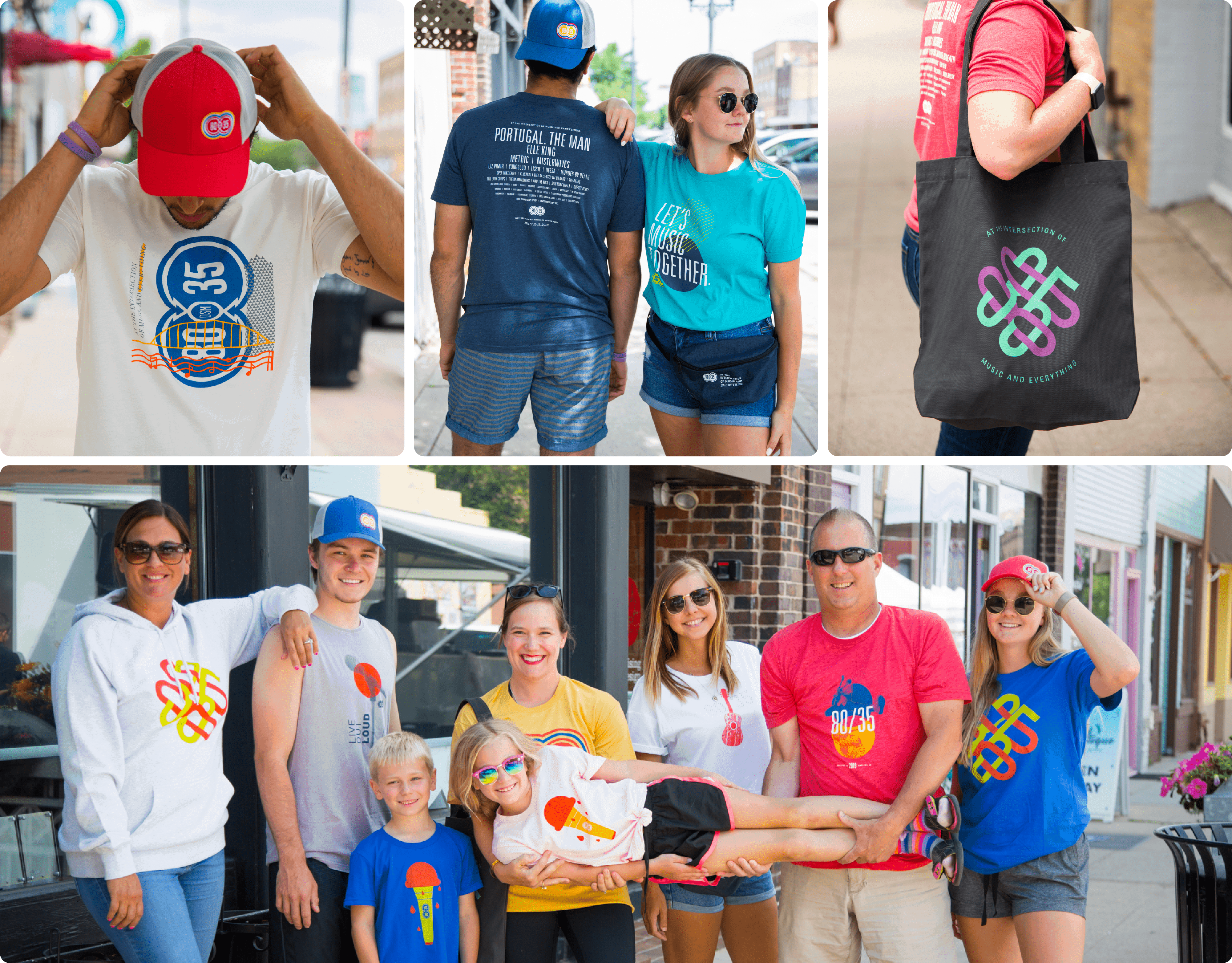
We may be biased, but we believe amazing merch can make a festival. We wrote, designed and managed the production of t-shirts, hats, bags, koozies, and more so festival goers could take home a piece of the fest as a souvenir.
Illustration
Iconic illustrations.
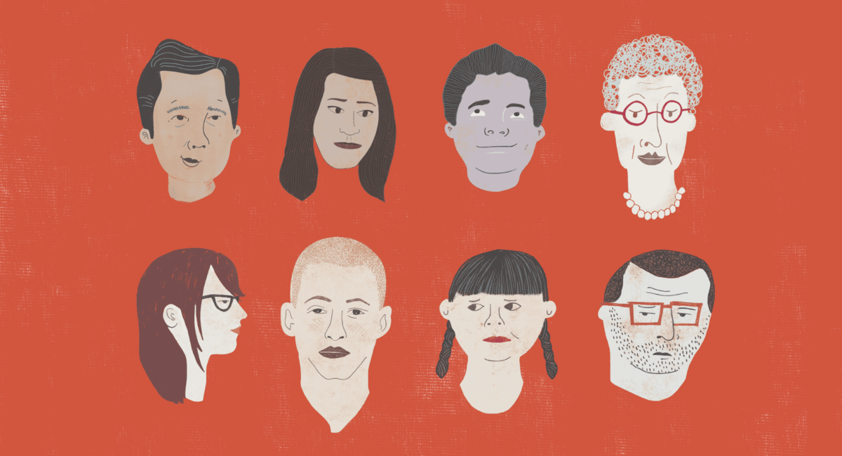
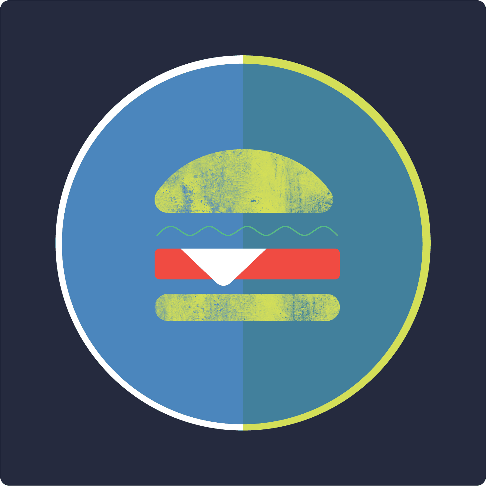
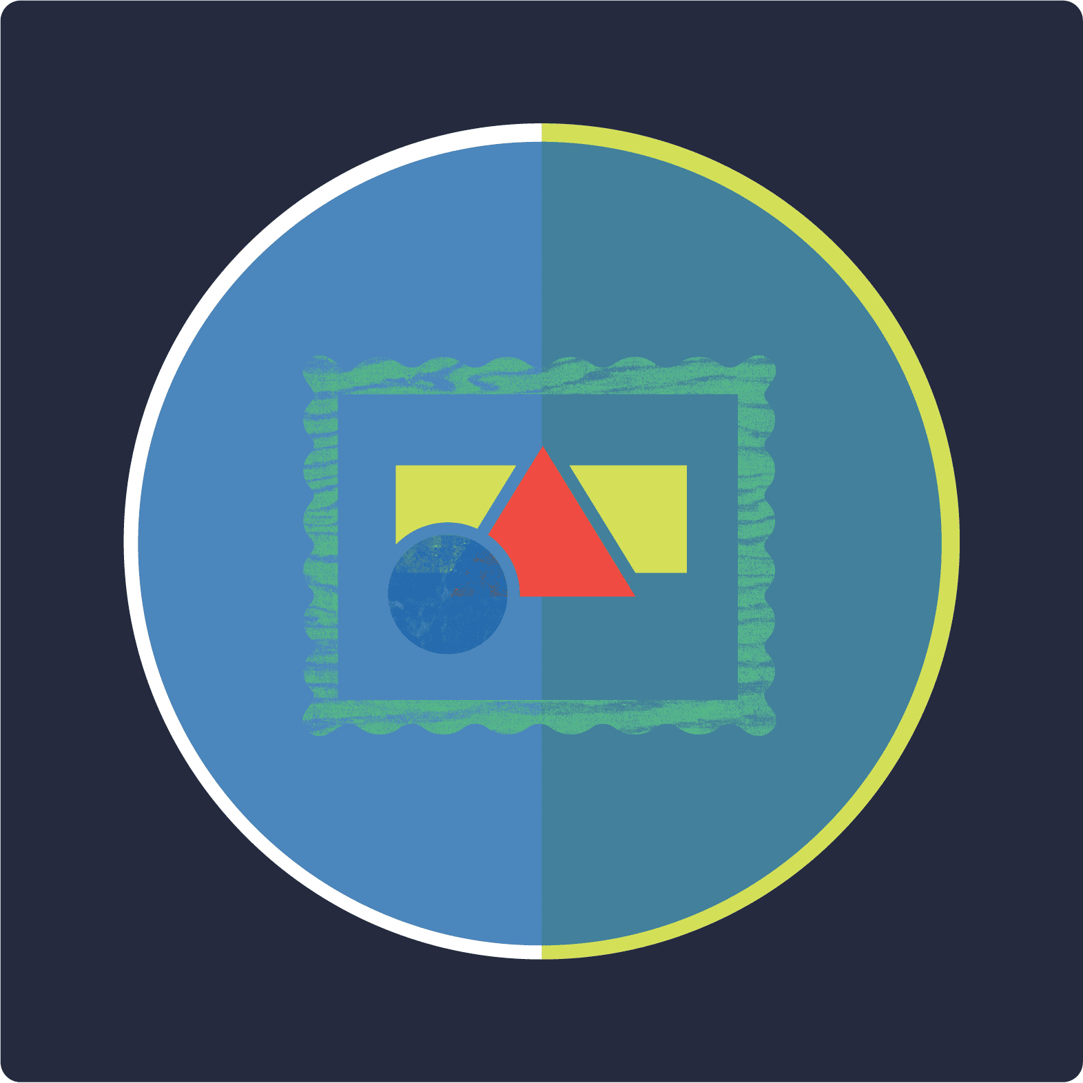
Part of the new brand called for updated illustrations for different aspects of the festival, including VIP perks. Our designers created a series of custom icons for use on the website that established a truly cool vibe for the event. They definitely earned an encore.



Event
Setting the stage.
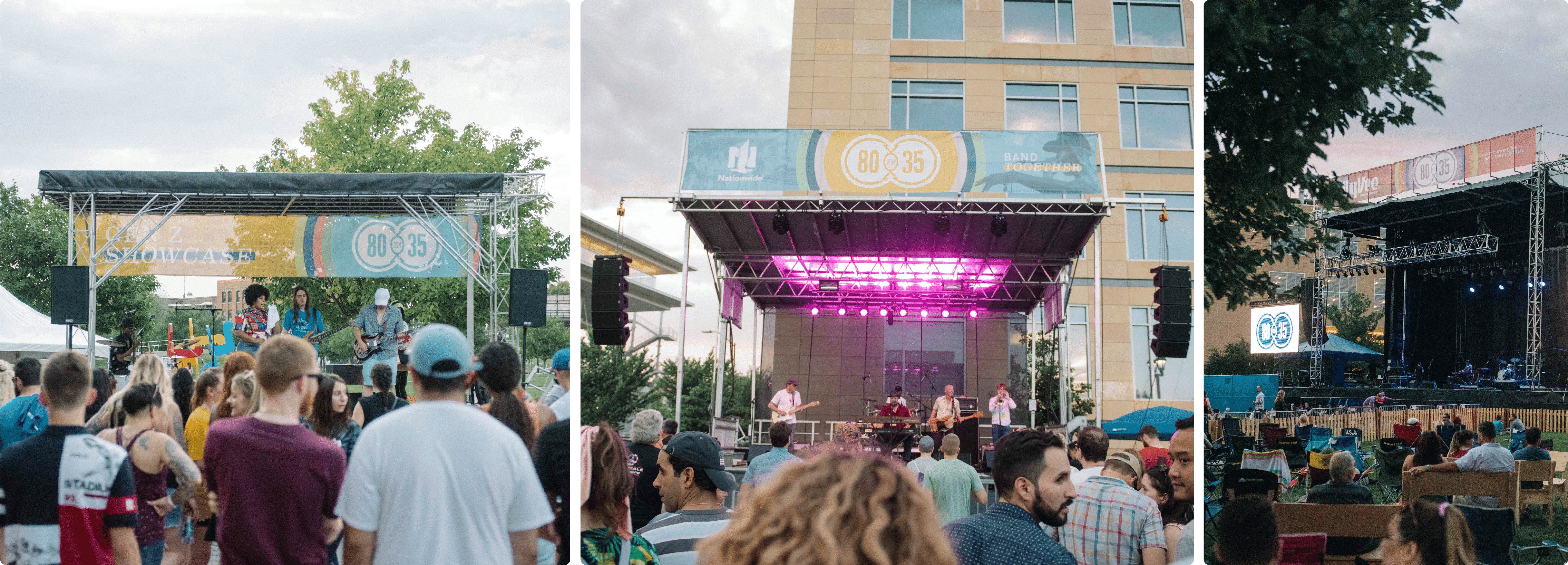
In addition to all of the digital and printed pieces we created for the festival, Red Dot also designed event and wayfinding signage, including dynamic stage banners, informative ticketing banners, and wristbands—all branded to perfection.
