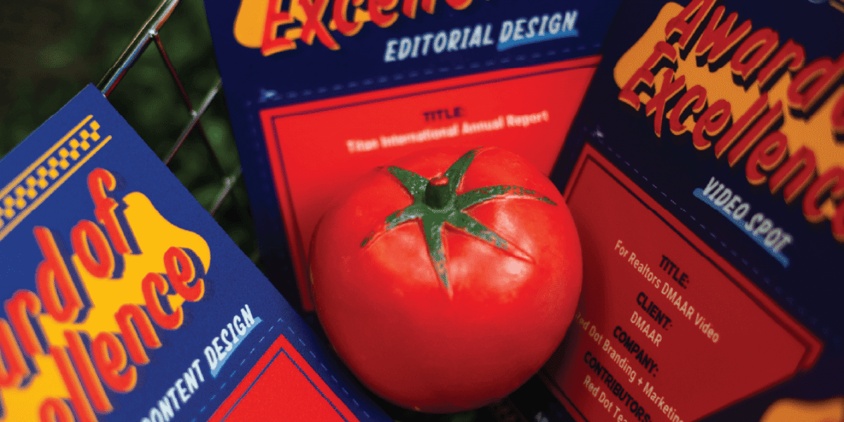
When What Wins is What Works
| Red Dot | News
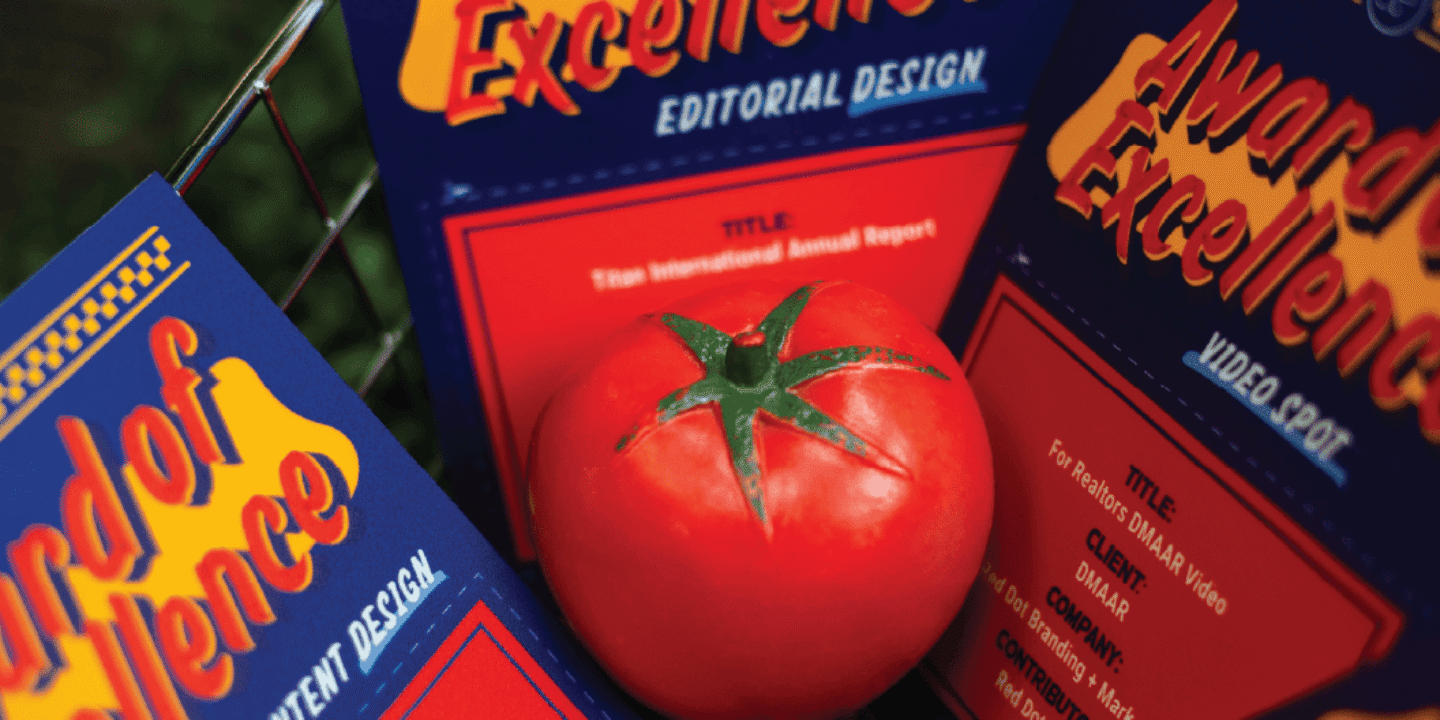
Awards are easy to celebrate. They’re harder to earn. And the ones that matter most are those that started as a real problem, a real client, a real story worth telling.
This year, Red Dot was recognized across three organizations: the National Agri-Marketing Association (NAMA), the Public Relations Society of America (PRSA), and the Art Directors Association of Iowa (ADAI). Five clients. Seven projects. Nine entries. All answering the same question we ask on every engagement: What does this audience actually need from us right now?
What follows isn’t a highlight reel but a look inside the work. Why we made the choices we did, what it meant for our clients, and what it says about how we believe brand and business should work together. And, of course, none of it happens without clients who are willing to collaborate openly, trust the strategy, and give us room to take the risks that make great work possible.
Table of Contents
- NAMA: National Agri-Marketing Association
- PRSA Iowa Chapter PRIME Awards
- ADAI: Art Directors Association of Iowa
- What the Work is Really About
NAMA: National Agri-Marketing Association
The Best of NAMA awards are the highest recognition in agriculture marketing, drawing entries from the country’s most formidable ag brands and agencies. This year, we took first place—nationally—in social media influencer activation. Our competition included entries from John Deere, Sygenta, and Corteva, along with some of the most respected agencies working in ag today.
We didn’t win because we out-produced them. We won because we out-storyed them.
Accu-Steel X That Fit Agvocate | First Place, Region 3 + Best of NAMA
Cattle producers are a tough audience to move. They’re risk-averse by nature, skeptical of anything that feels like marketing, and deeply loyal to what’s worked for them before. So when Accu-Steel came to us with a challenge—overcoming a perception that fabric-covered barns were ‘temporary’ or risky—we knew specs and sales language weren’t going to cut it.
What would work? A real farmer, telling a real story, to other real farmers.
Andrea Flemming, who goes by That Fit Agvocate, is a fifth-generation farmer, entrepreneur, and genuine Accu-Steel customer. We believed she was also the exact right person to shift this conversation.
The idea was straightforward: invest deeply in Andrea’s story, give her the space to tell it authentically, and let that story do the heavy lifting across every channel we could put it on.
This is what story-first strategy looks like in practice: one story, told and retold and reinforced across owned, earned, and paid channels simultaneously. A long-form blog. A customer testimonial video. Social clips. Andrea posting on her own YouTube and TikTok channels. Us resharing what she posted. Her resharing what we published. A community, built around one authentic voice—with minimal guardrails, because her authenticity was the point.
The results proved the investment:
- 93.9% increase in social audience growth in the 60 days after launch
- 72,800 impressions from 37 posts featuring Andrea in 2025
- 9.3% engagement rate on Andrea content vs. 5.4% channel average
- 2.4K views on Andrea’s YouTube feature, with 46.1% completion rate
- 68,429 TikTok views across 12 videos, with 83.9% U.S. viewership
But the number that matters most isn’t in any analytics dashboard. Farmers are calling Accu-Steel and specifically referencing Andrea’s story as the reason. They’ve watched her videos, followed her journey, and decided they trust Accu-Steel because a fellow farmer does. That’s behavior change. And because of it, Accu-Steel’s sales team can focus on growing new verticals instead of manually nurturing leads that the content is now converting for them.
This is what we mean when we talk about story-first strategy. Find the story worth telling. Invest in it fully. Repurpose it everywhere. The more you put into the story up front—the richer the video, the deeper the content, the more complete the narrative hub—the more legs it has, and the longer it works for you.
Any great story in any industry can work this way. This one just happened to be set on a farm in southwest Minnesota.
PRSA Iowa Chapter PRIME Awards
The PRSA PRIME Awards evaluate communications work on strategy, audience alignment, and measurable outcomes. This year, we submitted four entries and came home with three first-place wins and one merit award across three very different clients, challenges, and definitions of what “the right thing to say” looks like.
What ties them together isn’t a tactic or format, but a discipline. It’s about knowing your audience well enough to discern what they need (and what they don’t).
Note: the Titan Annual Report received a merit award, and was also recognized by ADAI. We’ll get into the details of that project later in the blog.
“The Barn That Brought Her Back” | First Place, Feature Writing
Andrea’s story deserved space—room to breathe, room for the hard parts, room for the kind of detail that makes a skeptical farmer lean in and think, “That sounds like my operation.”
“The Barn That Brought Her Back” is a long-form feature centered on Andrea’s journey back to her family’s fifth-generation farm after her plans for vet school fell through. It’s a story about resilience and rerouting, yes. But! It’s also a story that methodically, naturally addresses every objection a cattle producer might have about a fabric-covered barn. Wind performance. Winter conditions. Labor efficiency. Animal health. Generational transition. All woven into a lived experience, not product claims.
The piece generated 12,000+ pageviews and acted as the central narrative hub for the entire Accu-Steel influencer campaign—anchoring the video, informing the social content, and giving the sales team a shareable, durable asset that continues to work long after it went live.
Built Around You Blog | First Place, Blog
In 2025, we repositioned Accu-Steel’s existing blog from a traditional content channel into a strategic, audience-first editorial platform built to support how facility decision-makers actually research and buy. These aren’t impulse purchasers. We’re talking operations leaders, facility planners, and business owners who conduct extensive independent research before they ever talk to a salesperson.
So, we shifted the content strategy completely. Out went product-centric messaging. In came customer experiences—real operational challenges like post-derecho recovery, facility deterioration, and long-term ROI evaluation. Every post was written to prove out Accu-Steel’s “Built Around You” brand promise based on real evidence. Plus, content was structured to work for our human readers and search visibility.
The results reflected the repositioning:
- 81% year-over-year increase in total blog pageviews
- 143% increase in blog’s share of overall website traffic
- 718% increase in organic social traffic to the blog (also a proof point to the strength of an owned content ecosystem)
- 7.7% average engagement rate on social posts featuring blog content vs. 4.8% channel average
Wandah Pre-Launch Handout | First Place, Collateral
Hope Jensen is a certified menopause practitioner, founder of With Hope Clinic in Audubon, Iowa, and the inventor of Wandah—a reusable, 100% medical-grade silicone applicator designed to make the patient experience of applying vaginal estrogen cream easier, cleaner, and more sustainable.
In October 2025, Hope had one shot to introduce Wandah to the right people: The Menopause Society Annual Meeting, attended by more than 1,600 clinicians who actively prescribe vaginal estrogen.
There was just one complication: the product wasn’t available yet.
So, we encouraged Hope to use this platform as a chance to build trust, not sell. In a room full of highly educated, evidence-driven healthcare professionals, aggressive sales materials would actively undermine everything Hope was trying to build. So instead, we designed a two-sided handout that functioned as a conversation extender rather than a grab-and-go flyer. Minimal copy. Clean, clinical design. A clear explanation of the problem Wandah solves. Hope’s credentials front and center. And a QR code linking to a voluntary newsletter sign-up (with explicit reassurance that signing up didn’t mean being inundated with marketing).
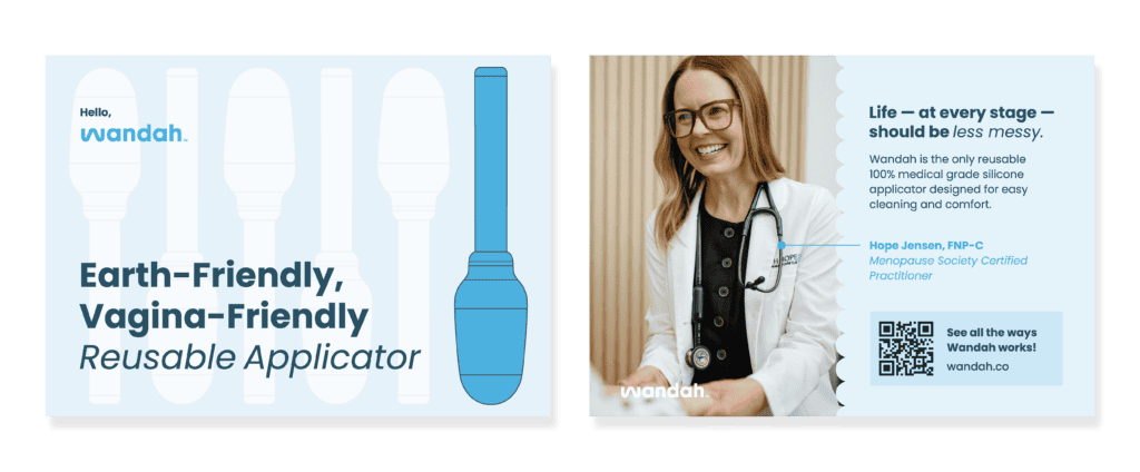
Hope staffed the booth personally, sharing the handout during substantive peer-to-peer conversations. As a result, we saw:
- 129 total voluntary clinician newsletter sign-ups
- 32 sign-ups occurred during the conference itself
- 34 additional sign-ups in the three days immediately following
We’re proud of this piece for a reason that goes beyond the numbers: it’s an example of restraint as strategy. Knowing what not to do (and having the discipline to do less, better) is one of the harder things to get right in marketing. We got it right here.
Wandah is launching soon! We wholeheartedly believe in this product, and we believe in Hope. Watch this space.
ADAI: Art Directors Association of Iowa
The ADAI Design Exhibition is where design is evaluated on its own terms. Not by metrics or outcomes or audience alignment, but by the quality and intelligence of the work itself. How it looks. How it’s constructed. How smart the decisions are.
We had four entries accepted into this year’s showcase. That matters to us because we are, at our core, deeply committed to our craft. Strategy without execution is just a plan. The design has to deliver.
Dogs of Red Dot | ADAI Showcase, Social Media Content Design
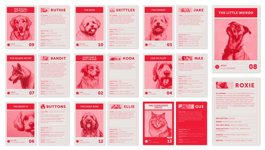
The Dogs of Red Dot series transformed our four-legged regulars into collectible character cards—each one designed with its own distinct visual treatment, its own personality attributes, its own unmistakable identity. Think less ‘cute dog photo’ and more ‘limited edition trading card meets brand persona workshop.’
That last part is intentional. When we work with clients on brand positioning, we often ask them to identify with archetypes—to recognize which characteristics feel most like them and why. The dog cards are a playful, visual extension of that same thinking, applied to our fur babies. Each card is distinctive. Each is cohesive. Together, they feel unmistakably Red Dot: warm, creative, a little bold, and completely authentic.
For Realtors, DMAAR | ADAI Showcase, Video Spot
The Des Moines Area Association of Realtors came to us with a real perception problem. A lot of people think realtors are overpaid. They see the commission, not the chaos: the late nights, the last-minute calls, the all-hands-on-deck urgency that defines what this work actually looks like.
We could have made a sincere, earnest video about how hard realtors work. That version would have been fine. It also would have blended in.
Instead, we went cinematic. We built the concept around a deliberate spoof of real estate reality television—the glossy, over-produced drama of shows like Selling Sunset and Million Dollar Listing. The joke, executed well, makes the point better than sincerity could: realtors work this hard, and they do it without camera crews and cocktail parties. Full shoot schedule. High production value. The result looks nothing like a trade association video—which was exactly the goal.
Great creative sometimes means making the case for a higher investment because the cheaper version won’t achieve what the client actually needs. That was the right call here, and the design work reflected it.
Accu-Steel 25th Anniversary Mark | ADAI Showcase, Identity Mark
A milestone like 25 years deserves more than a number in a circle. It deserves a mark that means something—one that earns its place on a leather hat patch and a trade show banner with equal credibility.
The Accu-Steel 25th anniversary logo is built around a hexagon—a nod to the steel trusses that define the company’s fabric-covered buildings and make them structurally distinct. Clean, confident, and instantly recognizable to anyone who knows what Accu-Steel builds. It works at any scale: embroidered on merchandise, printed on sales materials, shared on social. It just looks right, because the design logic is sound.
Accu-Steel appears across all three awards organizations this year—NAMA, PRSA, and ADAI. That’s not a coincidence. It’s what happens when a client gives us real access, treats us as part of their internal team, and trusts us to bring our full range of capabilities to bear. We become ingrained in the business, not just the marketing. And when that happens, the work gets better across the board—strategically, creatively, and in outcomes. (It’s a model we’d love to replicate with more clients.)
Titan International 2024 Annual Report | ADAI Showcase, Editorial Design
A global manufacturer with operations across agriculture, earthmoving/construction, and consumer markets has a lot to communicate in a single annual report. Segments. Regions. Financials. Strategy. Training. Acquisitions. It’s a lot of ground to cover, and the design has to make it navigable without making it feel like a homework assignment.
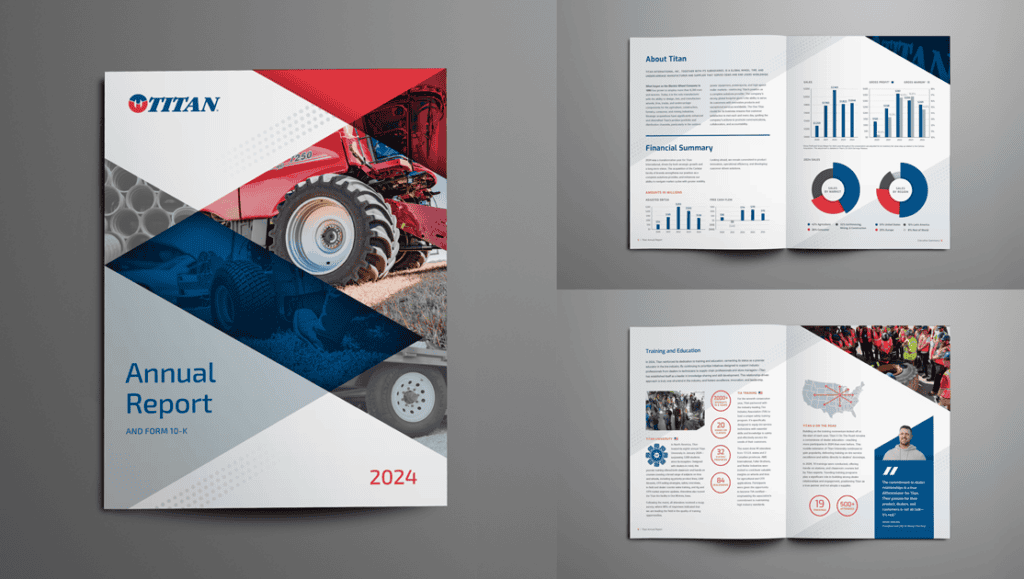
The Titan Annual Report was recognized by both PRSA (for strategic communications) and ADAI (for design excellence)—a distinction that says something meaningful about what the work actually accomplished. And most importantly, the report was also recognized by our grateful client, who said this was their best Annual Report to date.
The design didn’t just make the report look good. It made a complex document legible, organized, and credible. It held a lot of information without losing the reader. That’s the craft at work: design that improves comprehension, not just aesthetics.
What the Work is Really About
Nine entries across agriculture, real estate, healthcare, financial communications, and our own brand. Different industries, different audiences, different challenges—and we showed up curious, made smart calls, and executed with care.
Explore more of our work: https://www.reddotad.com/work/
Awards don’t happen by accident. Neither does work that performs. The two tend to go together when the strategy is right, the story is worth telling, the audience is genuinely respected, and the craft is taken seriously from start to finish.
That’s how we work. And we don’t do it alone. Every piece of work on this list exists because a client gave us access, trusted us with their story, and let us take the risks that make the difference between work that performs and work that merely exists. That’s what we’d love to bring to whatever you’re building next.