A campaign that marked a fresh start for downtown.

Downtown rising.
Our Challenge
Marketing a milestone.
The 35th anniversary of the famous Downtown Farmers’ Market presented the DCA and Red Dot with an opportunity to rebrand the event and capture its essence by creating commemorative artwork to mark the occasion. The challenge was to capture everything the market offers (which is a lot) into a beautifully simple execution that felt fresh and fun. We knew just the team.
Our Solution
Fresh thinking.
The Red Dot creative team conceived an approach that was both elegant and festive. Then we went to work collecting a variety of experiences to be had at the market—from fresh eggs and homemade jams to handmade jewelry and musical entertainment. An authentic cross-section was represented in an eclectic way. Truly savory.
Logo Update
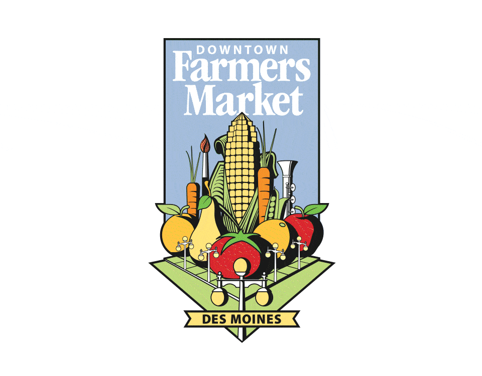
Fruitful evolution.
We started by evolving the logo with a fresh color palette featuring saturated tones for greater vibrancy. The font was updated to a clean san serif to improve legibility. And we simplified the street graphic to feel more modern and streamlined. Finally, we added a commemorative badge marking the iconic anniversary of the bountiful event.
Posters
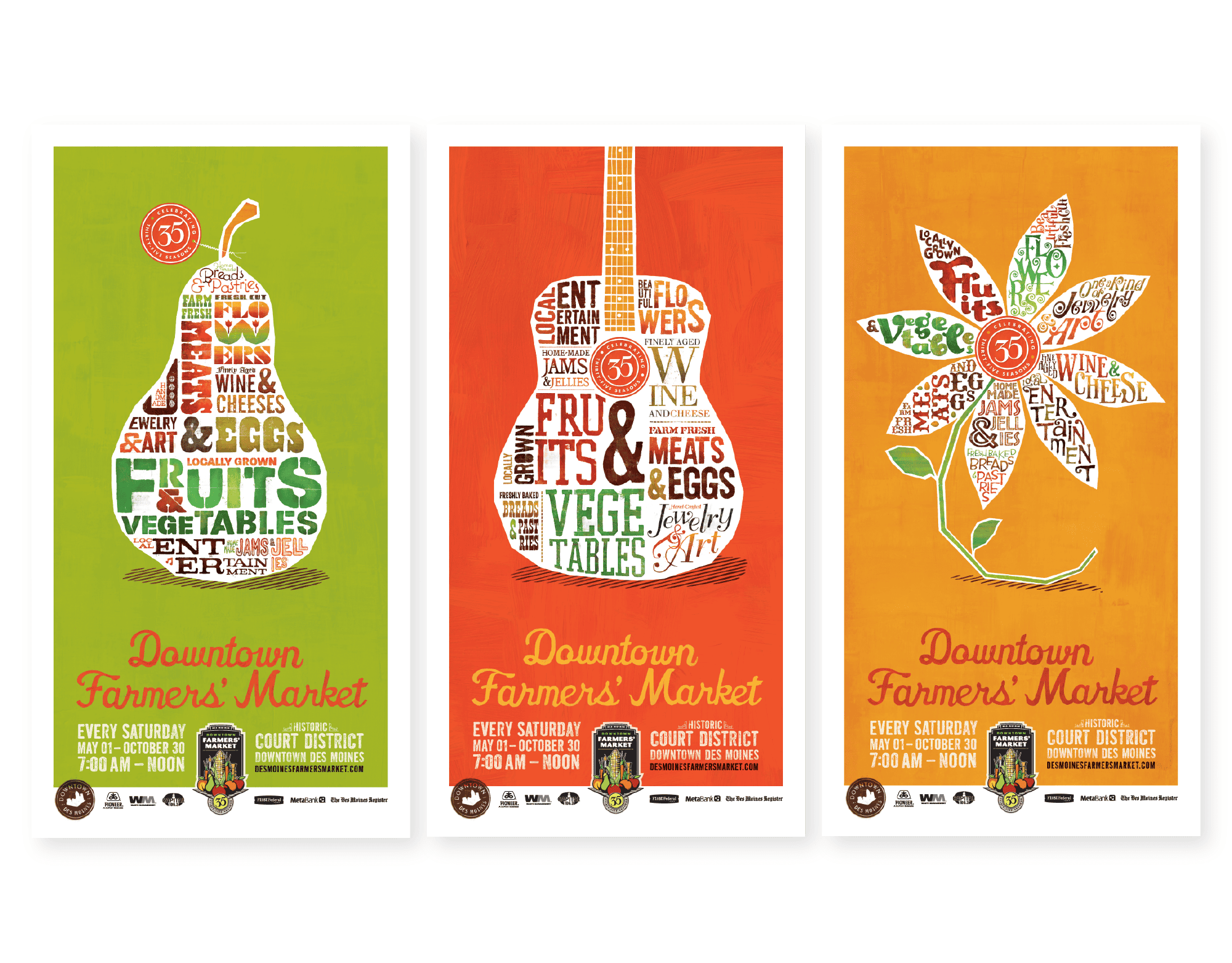
Organically executed.
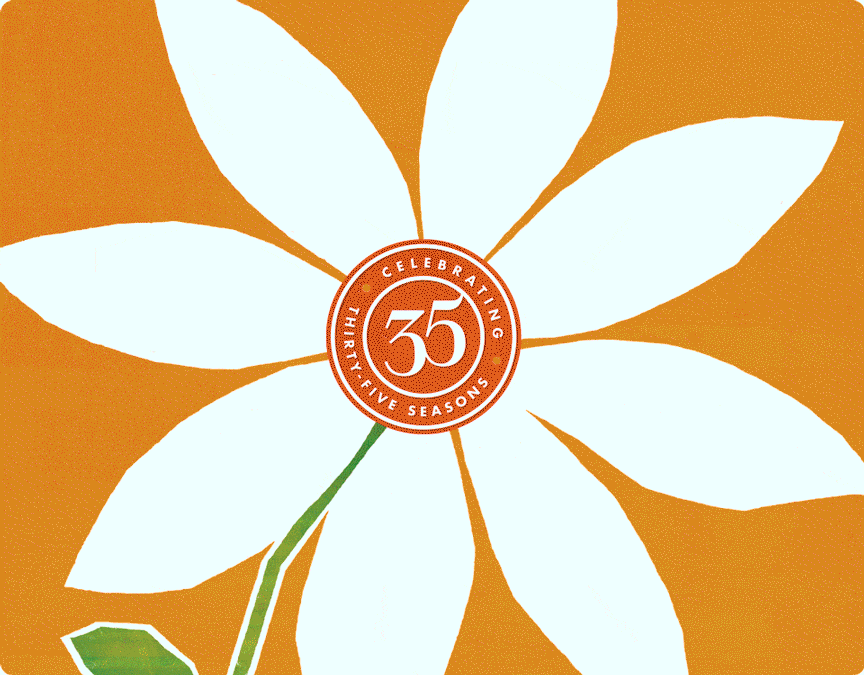
Professional and polished, but, at the same time, organic and authentic—the poster series features three executions that families seamlessly. A pear, guitar, and flower each represent a different aspect of the market. And, at the heart of each poster lives a custom 35-year mark to denote the market’s significant milestone as well.
Close-up Type
Tasty and tasteful.
Typography took center stage in this campaign as different typefaces, treatments, and colors were used to convey the feeling of eclectic vendors coming together. Breaking words in unusual places and adding graphic icons to replace letters added a bit of whimsy and surprise to each poster, which is exactly what attendees experience at the market.
Merch
Wonderfully wearable.
The graphics from the poster series evolved into merchandise to commemorate the triumphant 35th anniversary. From a distance, a simple guitar, but up close, layers of meaning and detail are revealed.